CASE STUDY - PEARSON REVEL MOBILE
Taking the complexity out of edtech to build better study habits
Pearson in the 2010s was known for feature-rich, impossibly deep courseware that provided students with a myriad of educational tools that could be as frustrating as they were useful.
Revel was intended as a Humanities-centric alternative, replacing complexity with engaging, interactive content and bite-sized practices to help build healthy study habits
The Story
Conjuring the Design Process
More than the others, this case study abides by a more ideal design process, likely more than is possible today. It has all hits: Problem definition, user research, information architecture, conceptual models and diary studies. It had a host of complexities and trade offs. The point, however, is that it is was a success execution of the tried and true design process. A rarity in my experience.
#UX Design
〰️
#Workshop Facilitation
〰️
#Co-Design
〰️
#User Research
〰️
#Information Architecture
〰️
#Conceptual Models
〰️
Visual Design
〰️
#UX Design 〰️ #Workshop Facilitation 〰️ #Co-Design 〰️ #User Research 〰️ #Information Architecture 〰️ #Conceptual Models 〰️ Visual Design 〰️
Outcomes - 2021
20%
Revel user download
4.8
Ratings with over 6k reviews
+16
NPS increase
“This app makes it simple to study anywhere”
Role
Design Lead
Team
UX Design, Product, Marketing, Engineering
Timeline
Ideation to Launch: 18 months
Shipped
Summer 2019
01 - The Tension & The Goal
Outperforming a declining market
By 2018, Courseware registrations were declining (3% YoY, 2018). At the same time, mobile usage for studying was increasing, leading to apps like Quizlet and Chegg, Revel was outperforming other Pearson products with a +40% registration rate.
There was already a Revel mobile app on the market, but it was a web app, non-performant, and the experience was more complicated than the service it provided. Its usage was unsurprisingly low.
The Goal
Increased Revel Registrations
Increased App downloads
Repeat usage (5-10 sessions a week)
A positive correlation between Revel usage and Exam scores


02- FROM THE STUDENT PERSPECTIVE
Co-design sessions unlocked new understandings
We hosted a 7-student panel to discuss study habits, tools they use, and pain points with courseware. We sketched possible solutions with them and mapped their habits.
What we learned:
Showing progress and completion is a reward
Study apps are used, but quality is hit or miss
Students read on their devices, especially on the go. Holding their attention, however, is the challenge
Other forms of media (audio, video, image based) is just as impactful on mobile devices and learning is not linear

04 - THE WORK
WE LANDED on a VISION of Casual Study Sessions
Instead of building digital assignments, we built interactive study modules designed to be completed in a series of rapid sessions. We built our journeys around practice rather than homework.
Desired outcomes
5-10 repeat sessions per week
65% completion rate (ambitious to be sure)
15% mbile app adoption by registered users
Positive Appstore reviews
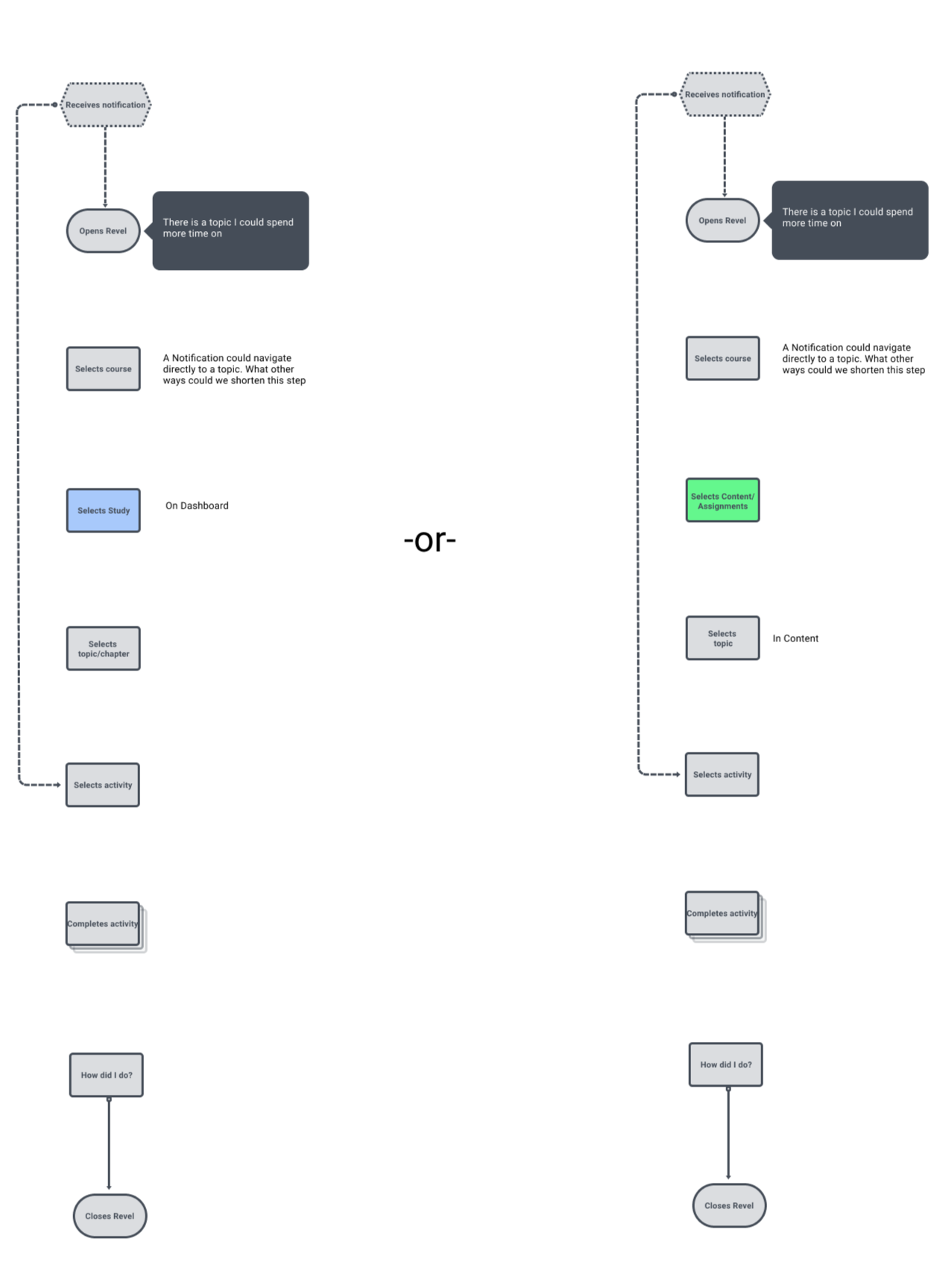
The Model: Motivated Reader
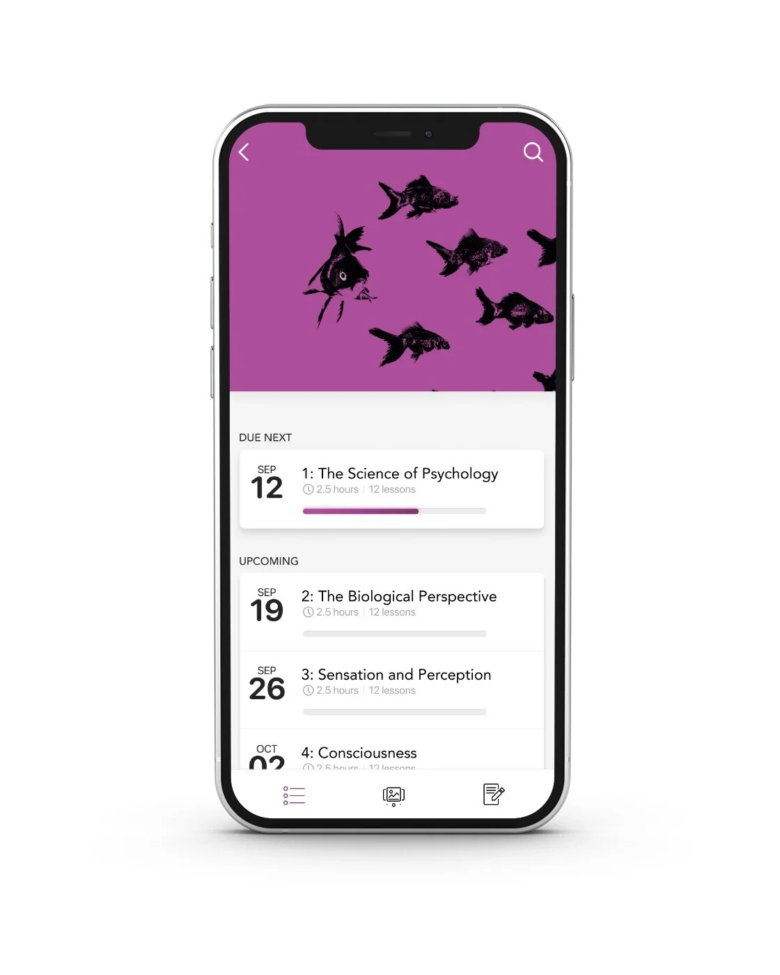
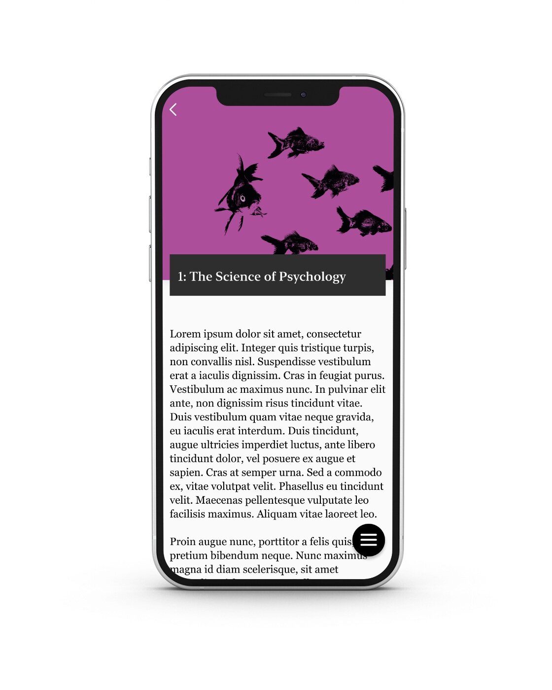
We came up with several conceptual models to see how short we could keep this journey, landing on two primary themes: The Motivated Reader (short blog-like articles and incentivizing progress) and Personalized Practice.

Model: Personalized Practice
We designed studies to be randomized based on learning objectives that the student needed to focus on the most. It was a great concept that was very difficult to pull off, given howcomplex the content tags were.

Look and Feel: A textbook sets the tone
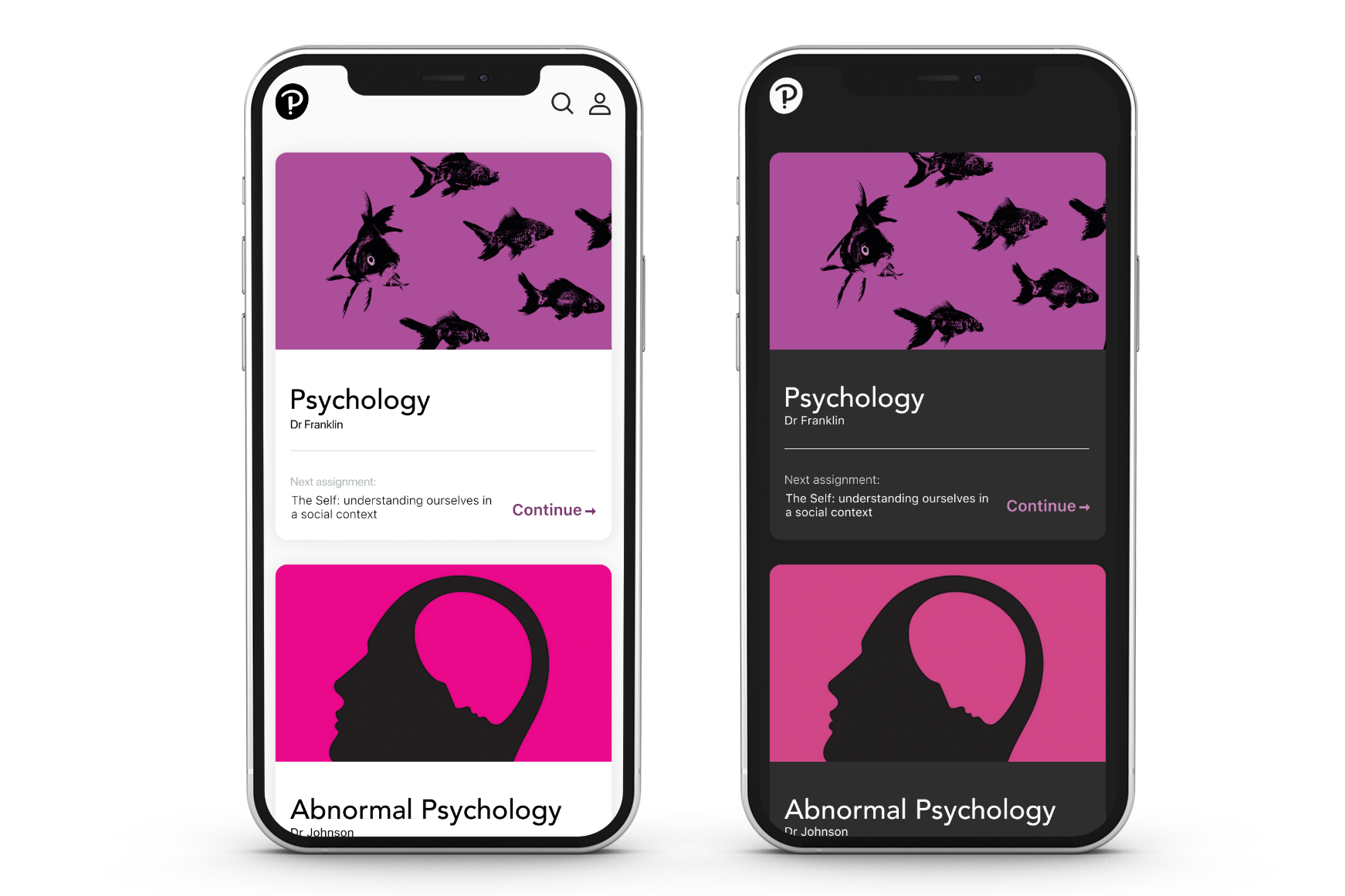
Pearson had just updated the branding for their Revel titles, and we were inspired by how bold and simple the designs were: high-contrast, often abstract images with simple, lean color palettes. We created themes that wove the titles’ primary color into the UI, so that every course experience had a distinctly unique feel.

05 - The Instructor Experience - A brief shout out
One App, two roles: Revel becomes a communication tool
While the student and their habits were our focus, we also released a companion Instructor experience, informed by interviews and diary studies, to create an interface that acted as a medium for communication between student and instructor.
The instructor experience provided an at-a-glance overview of the class’s health and what learning objectives were proving challenging. It also provided notifications on struggling students and warnings on low-activity students so that the instructor could intervene in real time

The Model: Behavior at a glance
The instructor experience was designed to be useful in short sessions, providing a real-time dashboard with an overview of the classes’ study behaviors and key metrics that the instructor could act on. It packs a decent amount of functionality in a very short journey
Outcomes - 2021
20%
Revel user download
4.8
Ratings with over 6k reviews
+16
NPS increase
“This app makes it simple to study anywhere”
06-Final Thoughts
The Double Diamond in action
When I was working at Pearson, I took General Assembly UX classes to break out of my own UX noise and gain a different perspective.
I don’t think I accomplished that, exactly. Years on, I think what I was looking for was a creative awakening to what I do that harmonizes with how I see myself (TMI).
What I did get out of it was a method to apply the mystical UX process “The Double Diamond”, a design approach that looks great on paper but doesn’t fit neatly into the chaotic, often emotional landscape of software development. Nor does it fit well with aggressive timelines and impatient stakeholders (I could write a manifesto on how procedural UX design has been more responsible for the downturn in UX jobs than AI has).
What makes this story significant is that it is probably the only time in my career that the Double Diamond actually worked, with positive outcomes. The stars aligned. We diverged. We converged. We created something awesome. We looked upon our works and did not despair.
I haven’t gone back to look at the app in recent years. Mostly because I am not able to, as I no longer have a Revel account, but the app store images still look like our final product.
You can find it in the App Store.